
The Flockeo barometer takes into account 4 key indicators to assess the ecological footprint of tourist destinations.
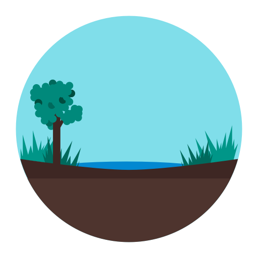
Quality of biodiversity
The International Union for Conservation of Nature (IUCN) is one of the world’s leading organizations dedicated to the protection and preservation of nature. It regularly publishes a red list on its website to map the animals or plant species at risk around the world.
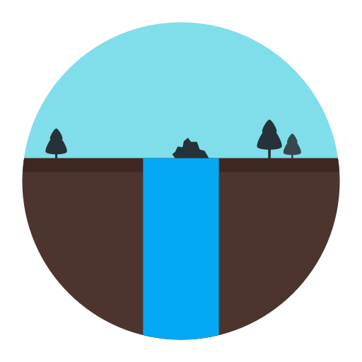
Pressure on water
Satellite data, together with other data sources, can be used to assess water-related risks. The Flockeo barometer accounts for the quantity, quality as well as existence and relevancy of the infrastructures set up to better manage water.

Population density
Cities have existed for thousands of years; they are essential for economic and social development. However, a growing town is a shrinking natural habitat. Our goal is to heighten awareness about this dilemma and to help you discover new tourist “green lanes”.

Air Quality
The air quality is a key factor for a pleasent stay in any destination. Whether it is the result of natural or manmade activities, air quality may show high variability due to sudden events (e.g. forest fires or industrial hazard); Flockeo shows the air quality over the past month as defined by the WHO.
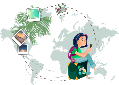
How to read the Flockeo barometer?

BIODIVERSITY.
The best results are deep green and relate to protected and controlled areas. Poor results are highlighted in lighter colors. They are allocated to regions that do not benefit from any control, funding or protection programs.

POPULATION DENSITY.
The ligther indicator points out a rural environment with a low density of dwellings and the purple indicator a very dense city. You will be able to steer to areas with a more or less dense urban fabric and create your own “green lane” throughout your travel itinerary.


PRESSURE ON WATER.
The more vulnerable the area is to flooding, drought, pollution or poor water management, the more it will be shown as a lighter area. On the other hand, a destination, whose quantity, quality and management of water are optimized, will be promoted as a perfect destination for a sustainable journey.

AIR QUALITY
The lighter the colour on the map, the better the air quality. We are taking a one month average measure to smooth the effect of any unusual event and show you relevant inforamtion on the current persistent air quality.
Based on 5 indicators, which are: Carbon monoxide, Nitrogen dioxide, Sulphur dioxide, Quantity of Fine Particulate Matter (2.5um in diameter), Quantity of Coarse Particulate Matter (10um in diameter)